Before maps became tools for satellite navigation, they were objects of beauty. Renaissance cartographers decorated their charts with sea monsters, compass roses drawn in gold leaf, and elaborate title cartouches framed by classical figures. The maps were functional: they showed coastlines, trade routes, and political boundaries. They were also art, commissioned by wealthy patrons who wanted to display their knowledge of the world on their walls.

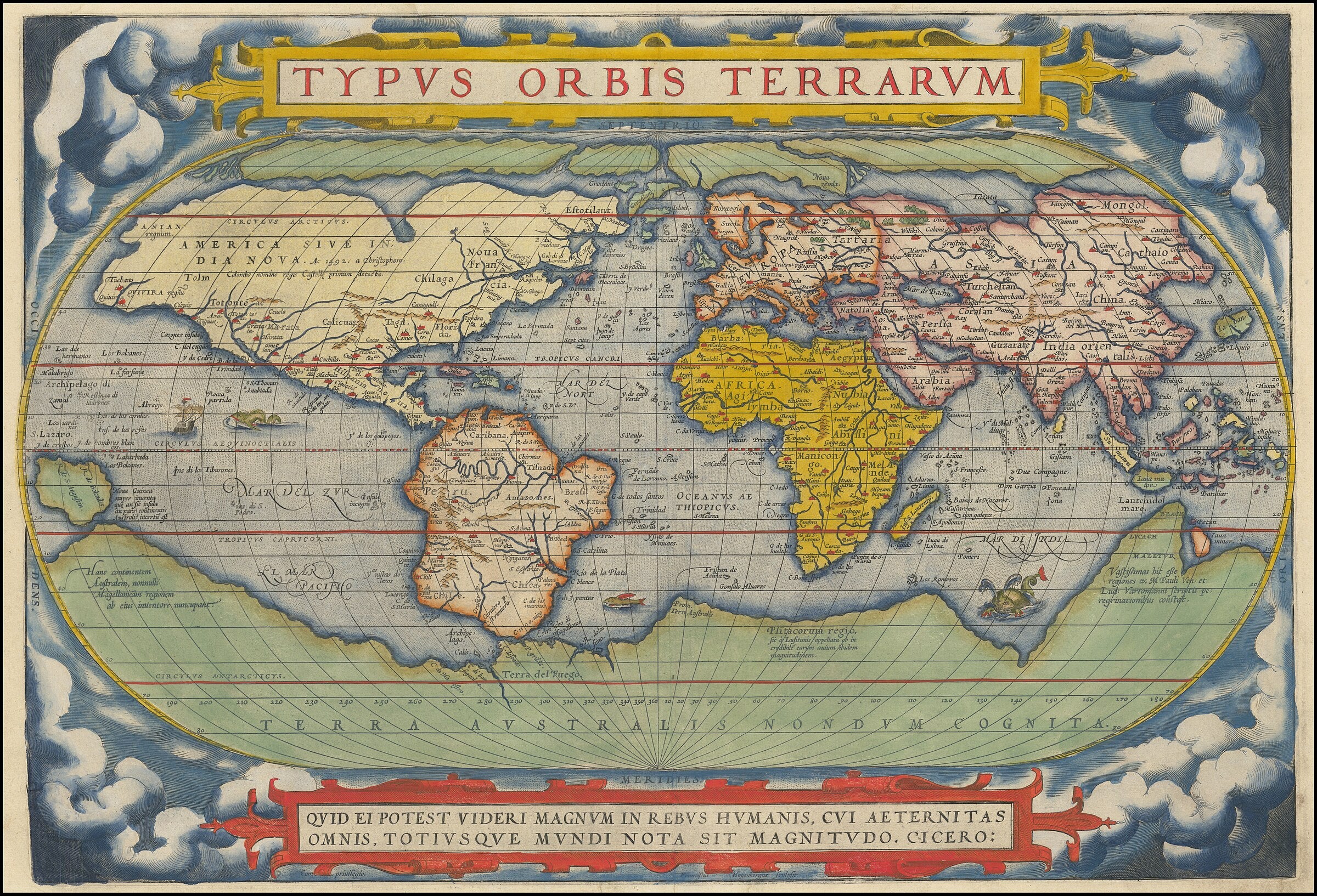
Ortelius and the First Atlas
Abraham Ortelius (1527 to 1598), a Flemish cartographer based in Antwerp, published the Theatrum Orbis Terrarum in 1570. It is widely considered the first modern atlas: a uniform collection of maps bound in a single volume, with consistent formatting and source citations. Before Ortelius, maps were sold as individual sheets of varying sizes and styles. He standardised them.
The world map from the 1572 edition shows the continents in a double-hemisphere projection, surrounded by ornamental borders with strapwork patterns in the Mannerist style. South America bulges improbably; the Pacific is too narrow; a vast southern continent ("Terra Australis Nondum Cognita") fills the bottom of the map. These errors are part of the charm. The map represents the best knowledge of its time, and the gaps in that knowledge are filled with decorative confidence.
Blaeu: The Golden Age of the Dutch Map
The Blaeu family (Willem Janszoon Blaeu and his son Joan) dominated European cartography in the seventeenth century. Their workshop in Amsterdam produced maps, globes, and atlases of extraordinary refinement. The Atlas Maior of 1662, containing 594 maps in eleven volumes, was the most expensive book published in the seventeenth century. Its maps featured hand-coloured engravings with gold highlights, decorative cartouches showing local figures and products, and title blocks framed by architectural elements.
Dutch map-making coincided with the Dutch Golden Age of painting, and the same attention to light, detail, and composition is visible in both. Maps appeared as props in paintings by Vermeer, who used them as symbols of worldly knowledge and as compositional devices (their geometric patterns contrasting with the soft forms of the human figures in front of them).
The Art of Not Knowing
Early maps are most beautiful where they are most wrong. The sea monsters that fill empty oceans were not superstition; they were a cartographic convention for marking areas where information was scarce. The elaborate compass roses served a practical purpose (indicating magnetic north for navigation) but were also exercises in decorative geometry. The human figures surrounding title cartouches told viewers about the cultures they would encounter in distant lands, filtered through European imagination.
Modern maps are more accurate and less interesting. The GPS screen that guides you through a city tells you exactly where you are but nothing about how it feels to be there. An Ortelius map tells you almost nothing about where you are but everything about how a sixteenth-century European imagined the world: as a place of wonder, danger, and opportunity, worth decorating with the best art available.
Maps are, in the end, arguments about what matters. The decorative cartographers argued that knowledge and beauty were not separate things, that understanding the world and celebrating it could happen on the same sheet of paper. It is an argument worth remembering.


