Cover of Broom, Vol. 4, No. 3 - El Lissitzky
Archival giclée
Frames arrive ready to hang
Secure checkout
Made to order
Description
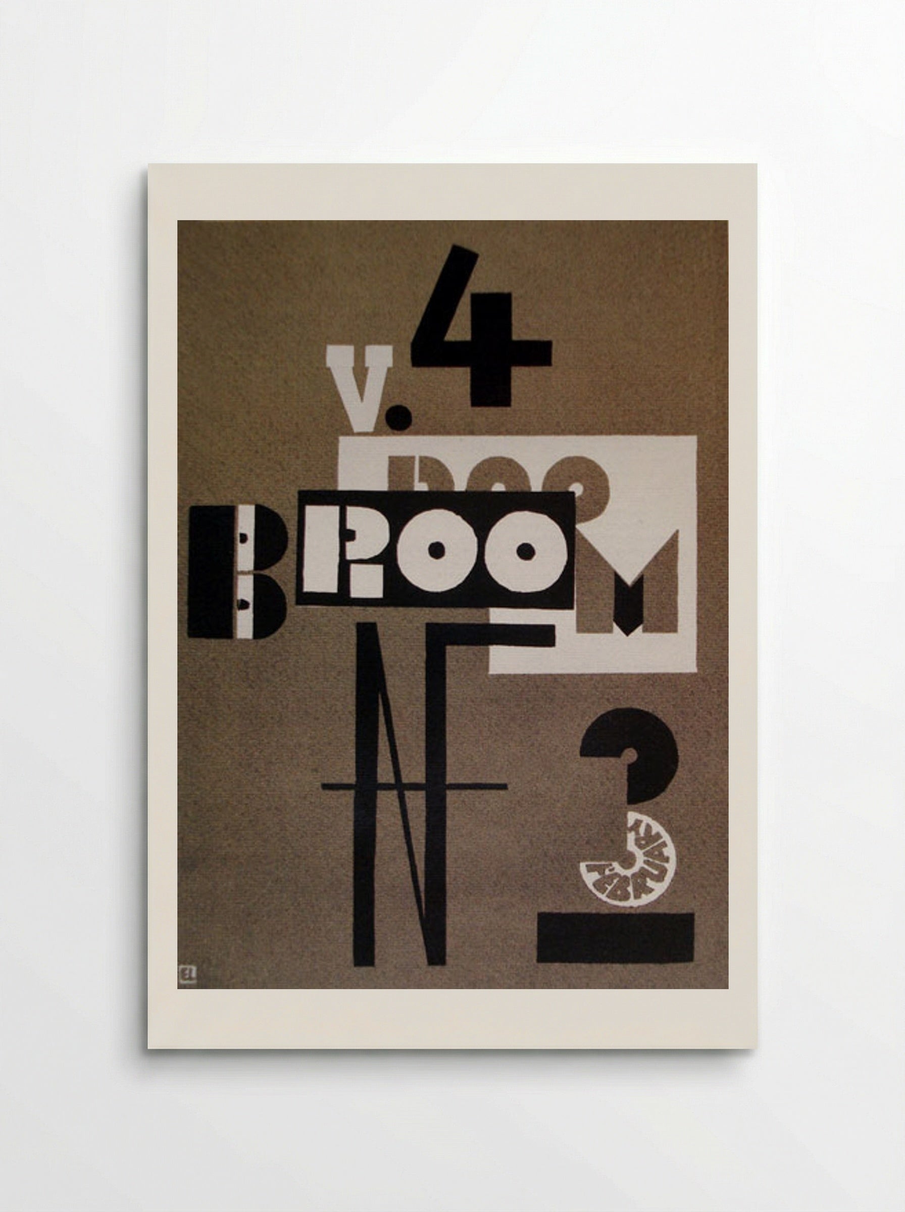
A 1923 Constructivist magazine cover by El Lissitzky featuring experimental typography and geometric forms. This work represents the New Typography movement of the early twentieth century.
El Lissitzky designed this cover for the February 1923 issue of Broom, an international magazine of the arts. The composition follows the principles of Constructivism, where typography functions as a structural component. Lissitzky used a palette of black and white with grey tones on a tan background to create a sense of spatial depth on a flat surface. The letters of the title are fragmented. The 'B' is split into two parts, while the 'ROOM' section is placed inside a black rectangular block. A large, thin 'N' for 'Number' dominates the lower half of the page, intersected by a horizontal line. The number '3' contains the word 'FEBRUARY' in a circular arrangement. This demonstrates Lissitzky's interest in non-linear reading paths and dynamic layouts. Lissitzky developed a series of works he called 'Proun,' an acronym for 'Project for the Affirmation of the New.' These works existed in the space between painting and architecture. The Broom cover applies these theories to the printed page. He treats the white rectangle behind the word 'ROOM' as a window or a floating plane. This creates a layered effect that defies the two-dimensional nature of paper. Broom was founded by Harold Loeb and Alfred Kreymborg to introduce European modernism to an American audience. Lissitzky produced this work during his time in Berlin. He acted as a link between the Russian avant-garde and Western movements such as De Stijl and the Bauhaus. This cover is a primary example of his 'New Typography.' This approach sought to modernise visual communication through clarity and industrial methods. The design avoids traditional ornamentation. Instead, it relies on the weight and placement of letterforms to create visual interest. The use of negative space and overlapping shapes suggests an architectural logic. This print captures a moment when graphic design moved away from illustration toward a more abstract, functional aesthetic.
Return policy
Because every print is made to order, we don't offer change-of-mind returns, refunds or exchanges. If your order arrives faulty, damaged or incorrect, we'll replace it free of charge — just contact us within 48 hours of delivery. See our refunds page for full details.
Shipping
We ship worldwide, printing at the production hub nearest to your delivery address. Delivery times and costs vary by destination — you'll see the options available to you at checkout.
Manufacturing
Each print is produced to order using 12-colour giclée printing on FSC-certified archival paper. Designed in Britain and printed at your nearest production hub to reduce waste and speed up delivery.
Cover of Broom, Vol. 4, No. 3 - El Lissitzky
Our Features
Designed for Lasting Impact
Specific Features
Every Solis piece is made to order with archival, gallery-quality materials built to last.
- Museum-grade giclée printing for rich, fade-resistant colour
- Archival matte fine-art paper, FSC-certified
- Multiple sizes and framing options available
- Frames in black, natural wood, dark wood or white
- Framed prints arrive ready to hang
Care & Cleaning
To keep your artwork looking its best:
- Dust gently with a soft, dry cloth
- Avoid prolonged direct sunlight
- Never use liquid cleaners on the print or canvas surface
- Keep in a dry, room-temperature space
- Handle prints with clean, dry hands
Materials & Sizing
Museum-grade giclée on FSC-certified archival matte paper, with framed and canvas options.
- Paper sizes: A4, A3, A2, A1, A0 and B2 (50×70 cm)
- Canvas: XS (20×30 cm) to Large (60×90 cm)
- Frames: black, natural wood, dark wood or white
Why Choose Us ?
Damage-free delivery guarantee
Fast Shipping
Museum-Quality Materials

Artist Biography
El Lissitzky
He was born Lazar Markovich Lissitzky in 1890. After returning to Russia, he worked alongside Malevich at the UNOVIS art school in Vitebsk, where Suprematism and the revolution were supposed to be the same thing. He became one of the most influential graphic designers of the twentieth century, his poster designs, book layouts, and exhibition installations connecting Russian avant-garde art to the Bauhaus and De Stijl in western Europe.
He contracted pulmonary tuberculosis and continued working as a book artist and photomonteur because he could do it lying down. His sister Jenta committed suicide in Vitebsk in 1925 while he was hospitalised in Switzerland. He married Sophie Kuppers, a German woman whose family disapproved of the match; she had to leave her sons behind to move to Moscow. He died in Moscow in 1941, the year Germany invaded Russia.
You May Also Like