Cover for 'Khorosho!' - El Lissitzky
Archival giclée
Frames arrive ready to hang
Secure checkout
Made to order
Description
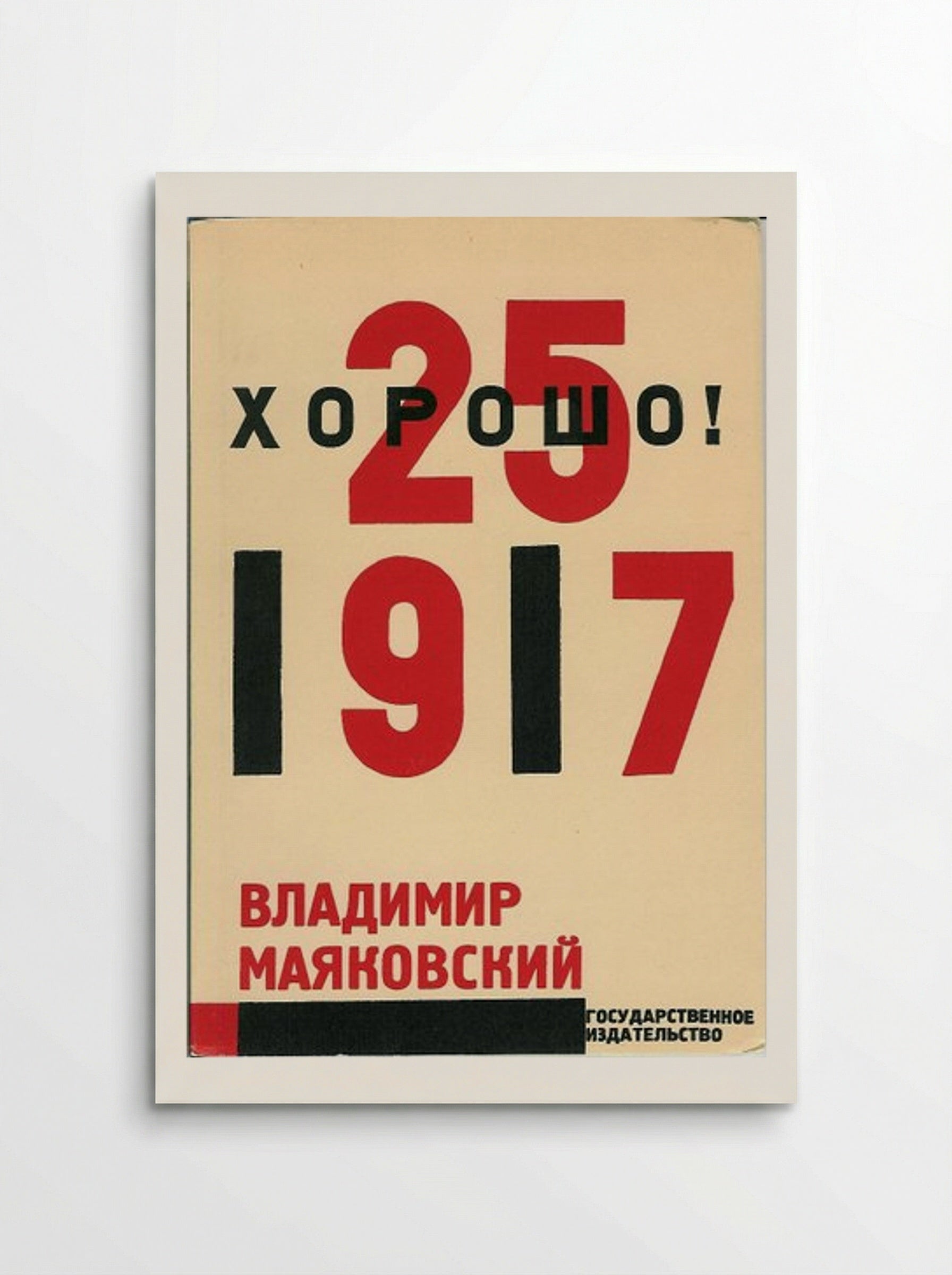
A 1927 Constructivist book cover designed by El Lissitzky for Vladimir Mayakovsky's poem Khorosho!. It features bold red and black typography on a cream background.
El Lissitzky designed this book cover for the 1927 edition of Vladimir Mayakovsky's poem, Khorosho! (Good!). The poem was written to commemorate the tenth anniversary of the October Revolution. Lissitzky was a leading figure in the Russian Constructivist movement. He applied architectural principles to graphic design and typography. This work is a primary example of his "New Typography" approach. Lissitzky began his career illustrating Yiddish children's books before moving towards the abstract language of Suprematism under Kazimir Malevich. By the time he designed this cover, he had transitioned to Constructivism, which sought to put art at the service of the state. He believed that the artist was a "constructor" or engineer of visual information. The composition relies on a restricted palette of red and black on a cream background. Lissitzky used bold, sans-serif typefaces and varied font sizes to create a sense of hierarchy. The large red numerals "25" and "1917" dominate the centre of the page. The Cyrillic title "ХОРОШО!" (Khorosho!) is integrated with the large "25" in a way that suggests depth despite the flat printing. Constructivist design rejected traditional decorative elements. Instead, it favoured functionalism and industrial production methods. Lissitzky viewed the book as a dynamic object where the layout should guide the reader's eye through the text. The use of heavy bars and geometric alignment reflects the influence of the Bauhaus and De Stijl movements on Soviet avant-garde art. The placement of the author's name, Vladimir Mayakovsky, at the bottom left creates a weighted base for the composition. This approach influenced decades of graphic design, particularly in the fields of poster art and editorial layout. The use of primary colours and geometric forms was intended to be accessible to a mass audience, stripping away the elitism associated with nineteenth-century fine art.
Return policy
Because every print is made to order, we don't offer change-of-mind returns, refunds or exchanges. If your order arrives faulty, damaged or incorrect, we'll replace it free of charge — just contact us within 48 hours of delivery. See our refunds page for full details.
Shipping
We ship worldwide, printing at the production hub nearest to your delivery address. Delivery times and costs vary by destination — you'll see the options available to you at checkout.
Manufacturing
Each print is produced to order using 12-colour giclée printing on FSC-certified archival paper. Designed in Britain and printed at your nearest production hub to reduce waste and speed up delivery.
Cover for 'Khorosho!' - El Lissitzky
Our Features
Designed for Lasting Impact
Specific Features
Every Solis piece is made to order with archival, gallery-quality materials built to last.
- Museum-grade giclée printing for rich, fade-resistant colour
- Archival matte fine-art paper, FSC-certified
- Multiple sizes and framing options available
- Frames in black, natural wood, dark wood or white
- Framed prints arrive ready to hang
Care & Cleaning
To keep your artwork looking its best:
- Dust gently with a soft, dry cloth
- Avoid prolonged direct sunlight
- Never use liquid cleaners on the print or canvas surface
- Keep in a dry, room-temperature space
- Handle prints with clean, dry hands
Materials & Sizing
Museum-grade giclée on FSC-certified archival matte paper, with framed and canvas options.
- Paper sizes: A4, A3, A2, A1, A0 and B2 (50×70 cm)
- Canvas: XS (20×30 cm) to Large (60×90 cm)
- Frames: black, natural wood, dark wood or white
Why Choose Us ?
Damage-free delivery guarantee
Fast Shipping
Museum-Quality Materials

Artist Biography
El Lissitzky
He was born Lazar Markovich Lissitzky in 1890. After returning to Russia, he worked alongside Malevich at the UNOVIS art school in Vitebsk, where Suprematism and the revolution were supposed to be the same thing. He became one of the most influential graphic designers of the twentieth century, his poster designs, book layouts, and exhibition installations connecting Russian avant-garde art to the Bauhaus and De Stijl in western Europe.
He contracted pulmonary tuberculosis and continued working as a book artist and photomonteur because he could do it lying down. His sister Jenta committed suicide in Vitebsk in 1925 while he was hospitalised in Switzerland. He married Sophie Kuppers, a German woman whose family disapproved of the match; she had to leave her sons behind to move to Moscow. He died in Moscow in 1941, the year Germany invaded Russia.
You May Also Like